Anchoring GenAI
What holds under pressure, and improves performance per dollar

The anchor gets the credit, but the chain does the work — just like infrastructure behind GenAI.
Executive Summary
This post documents a decision-grade RAG benchmark: the same stack, run the same way, across Akamai LKE, AWS EKS, and GCP GKE.
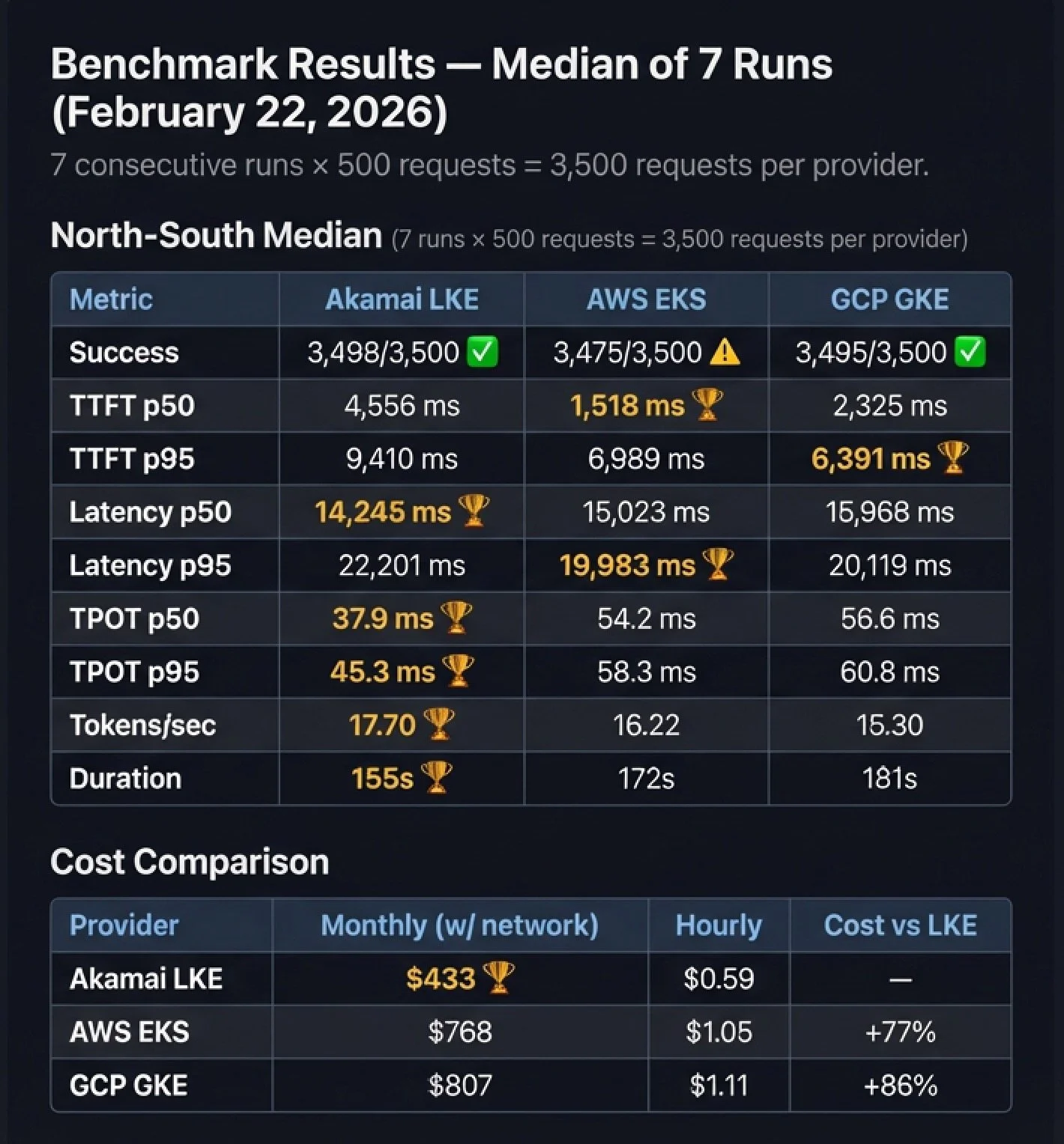
What I measured (Feb 22, 2026 | 7-run median | 3,500 requests/provider):
Under sustained load, LKE delivers the best performance-per-dollar. It leads on generation efficiency and throughput (TPOT p50/p95, tokens/sec, and total run duration) while running at $433/mo vs $768 EKS (+77%) and $807 GKE (+86%).
First-token and p95 behavior are split. EKS is fastest to first token at p50; GKE leads TTFT p95; EKS leads latency p95; LKE leads latency p50.
Reliability is part of the signal. Success totals: LKE 3,498/3,500, EKS 3,475/3,500, GKE 3,495/3,500.
Caveat: GPUs are Ada-generation across providers but not identical SKUs (RTX 4000 Ada vs L4). Controls live above the SKU: same workload, same measurement contract, same topology, and the same observability.
Disclosure:
I work at Akamai as a Field CTO in Cloud Computing. This project was built on my own time using publicly available infrastructure at retail pricing. No internal tooling, private APIs, or discounted rates were used.
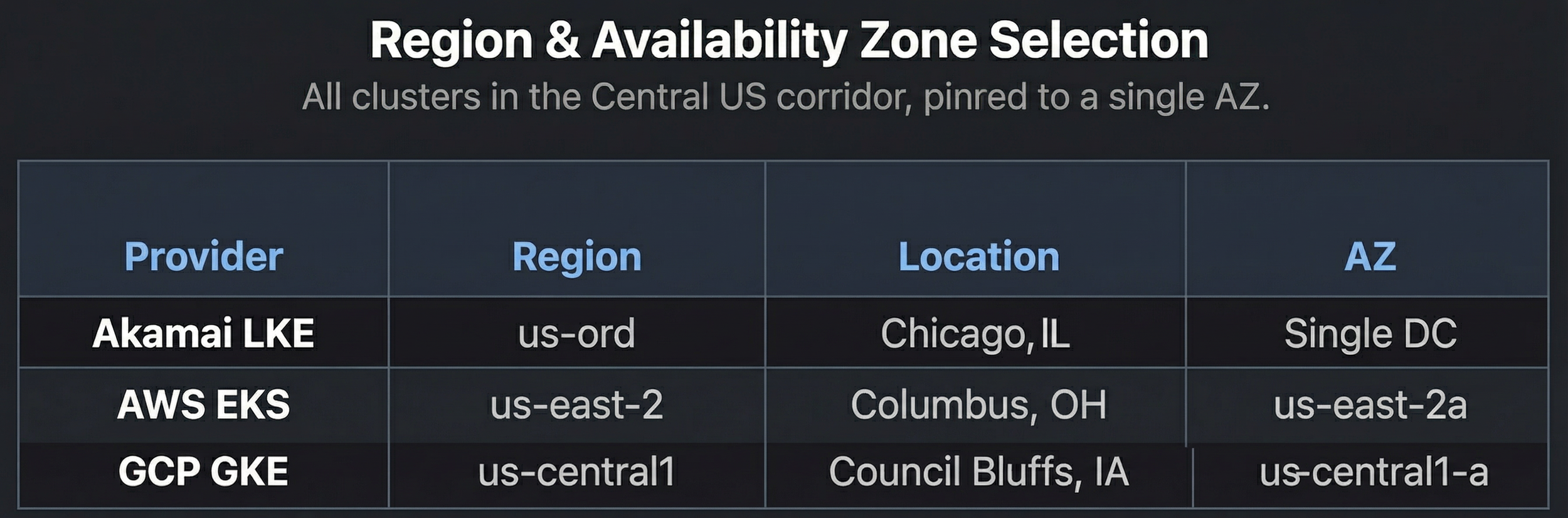
All tests ran from a single client in Dallas, TX against single-zone clusters in Chicago (LKE), Ohio (EKS), and Iowa (GKE).
The methodology, code, and raw data are open-source — run it yourself and verify every number.
The scorecard above is the “chain”—a repeatable way to measure what holds under real load and what it costs to keep it steady.
A New Benchmark for Retrieval-Augmented Generation
My job is to translate infrastructure into stories that resonate with two very different audiences: engineers who demand proof and executives who demand ROI.
Recently I read about how ships actually anchor. The anchor matters, sure—but what really holds the ship steady is often the weight of the chain. The chain creates a low-angle pull and absorbs motion, helping the anchor stay set. In other words: the part you don’t see is what creates stability.
That’s how a lot of GenAI programs feel right now. Teams can demo RAG and it looks great in calm waters. But as GenAI moves into production, the questions shift quickly to latency, cost, operational drift—and governance. Governance is critical, but it’s out of scope for this post. Here, I’m staying focused on the measurable foundation governance and FinOps ultimately depend on: performance, reliability, and cost.
And when it’s time to operate across environments and under real load, many teams struggle to measure consistently, forecast costs with confidence, or reproduce results across clouds.
So I built rag-ray-haystack: a cloud-portable RAG benchmark stack with a repeatable scorecard designed to answer one question cleanly:
For the same RAG workload, what performance and cost do we get across different cloud providers?
What I built
The architecture is intentionally modular—and deliberately “boring” in the best way: standard interfaces, standard metrics, minimal provider-specific wiring.
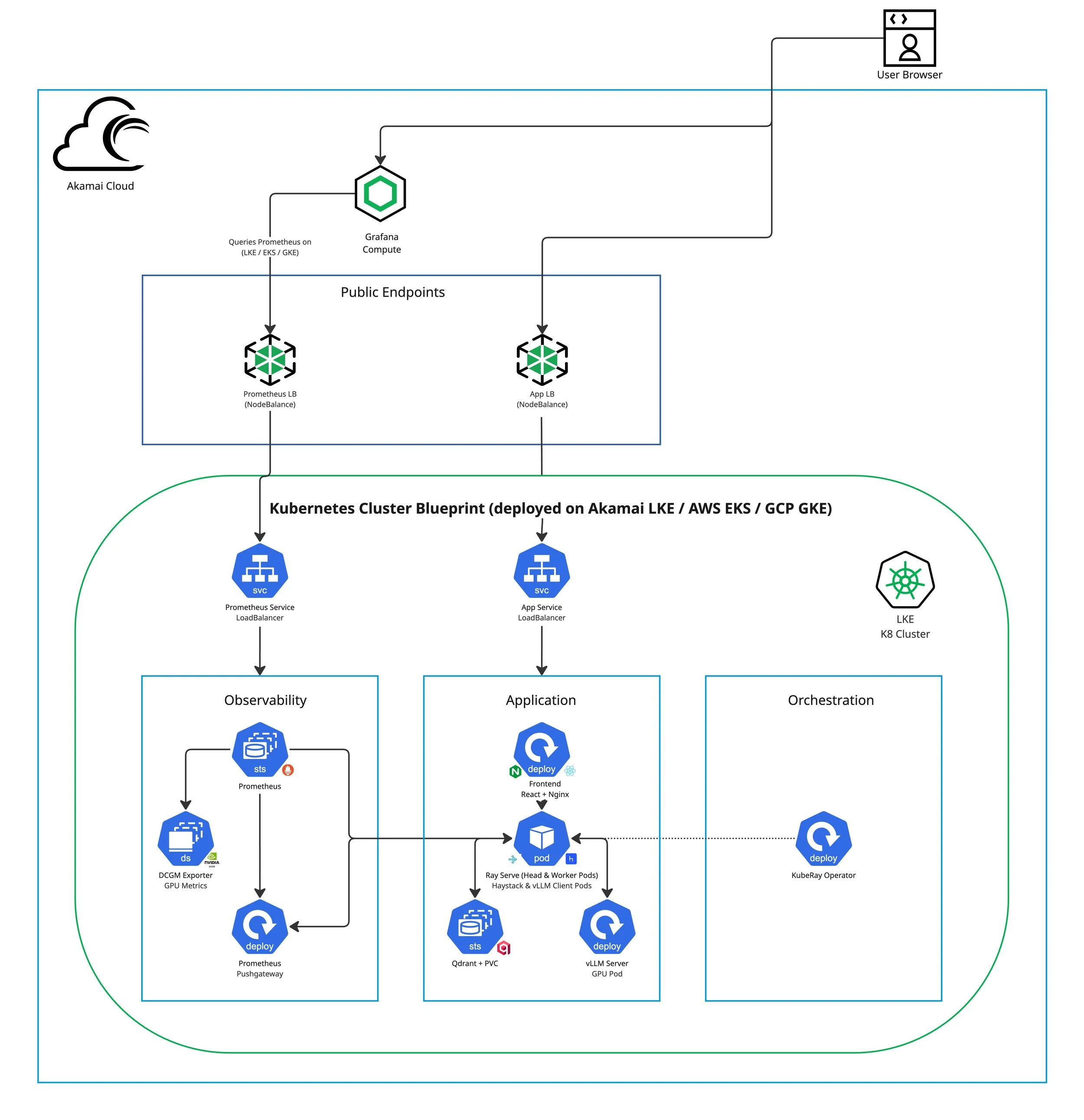
Public Endpoints: Two cloud-native load balancers expose the system: an App endpoint and a Prometheus endpoint(NodeBalancer / ELB / GCLB). In Kubernetes, each is represented by a Service of type LoadBalancer, keeping exposure consistent while allowing the underlying provider implementation to vary. The UI uses an
/apiproxy path to reach the backend consistently across providers.
Front-end (React + Nginx): Streams responses over Server-Sent Events (SSE), captures prompts, renders tokens in real time, and measures TTFT and total latency from the user’s perspective.
Backend (RAG API on Ray Serve): FastAPI + Ray Serve orchestrates retrieval + generation, uses Haystack to fetch top-k passages from Qdrant, and streams
meta,token,done,errorevents back to the UI.Ray runtime (KubeRay-managed cluster): Ray Serve runs on a Ray cluster (head + worker pods) managed by the KubeRay Operator, keeping scaling behavior and deployment shape consistent across providers.
vLLM Inference Server (GPU): A dedicated GPU-backed vLLM deployment provides token streaming for inference (model and serving parameters are tunable, but the measurement contract stays constant).
Vector store (Qdrant): Persistent similarity search for retrieval, typically deployed as a StatefulSet backed by a PersistentVolumeClaim (PVC) so collections and indexes survive pod restarts.
Infrastructure Parity: Terraform End-to-End
The layer some benchmarks skip
Some benchmarking write-ups stop at “here’s the application stack” and leave infrastructure as manual steps. That’s fine for a demo—but it breaks down the moment you try to reproduce results, compare environments cleanly, or defend numbers to skeptical engineers.
That’s why rag-ray-haystack includes end-to-end Terraform under infra/terraform/<provider> for each target cloud:
infra/terraform/akamai-lke/infra/terraform/aws-eks/infra/terraform/gcp-gke/
The goal isn’t just portability of YAML—it’s repeatability of the entire environment. Cluster creation, node pool sizing, GPU capacity, storage classes, and network topology are all codified. The benchmark becomes an engineering artifact—not a one-time event.
Conceptually:
</> bash
cd infra/terraform/akamai-lke && terraform init && terraform apply
cd infra/terraform/aws-eks && terraform init && terraform apply
cd infra/terraform/gcp-gke && terraform init && terraform apply
That “infra parity” is what makes the scorecard decision-grade—credible to engineers, and useful to executives evaluating performance per dollar.
Instance Selection
Why these aren't identical, and why the comparison is still valid
Cloud providers don't offer identical GPU SKUs, so the goal wasn't "same exact card." It was the closest practical equivalence for a single-GPU, inference-oriented workload. All three GPUs belong to the same NVIDIA Ada Lovelace architecture generation:
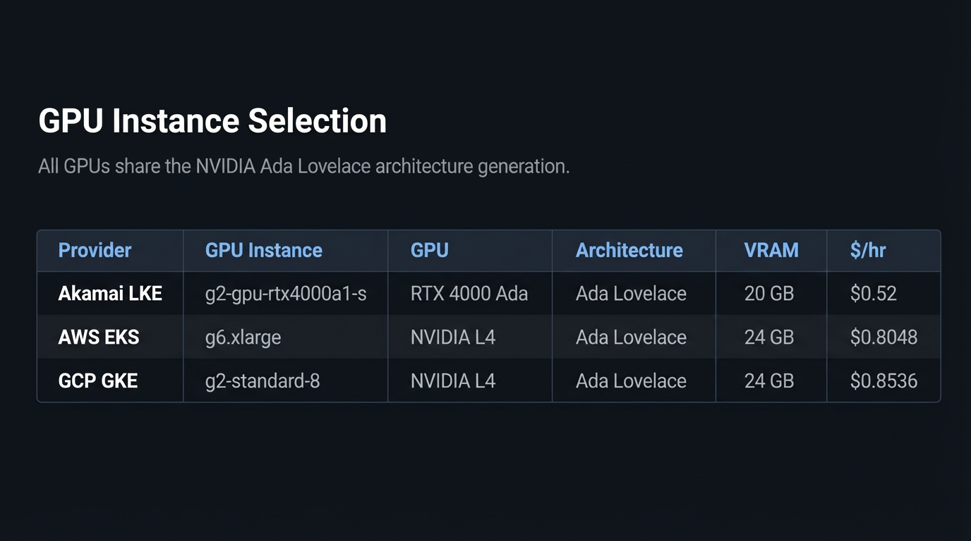
AWS and GCP both use the NVIDIA L4—widely available and commonly used for cost-efficient inference. On Akamai, the closest matching single-GPU option is RTX 4000 Ada. They're not the same SKU, but they share the same Ada Lovelace architecture and target the same job: token-streaming inference at reasonable cost.
To keep the benchmark honest, the controls live above the SKU: the same application stack (Qwen/Qwen2.5-3B-Instruct served by vLLM v0.6.2), the same embedding model (sentence-transformers/all-MiniLM-L6-v2), the same request shape (500 requests, 50 concurrency, 256 max output tokens), the same measurement contract, and the same observability pipeline.
GPU utilization, memory, and power draw are monitored via DCGM during every run to ensure we're measuring the system we think we're measuring—GPU + network + platform behavior, not an incidental bottleneck elsewhere.
The point of this benchmark isn't "whose GPU SKU is best"—it's what performance-per-dollar you get when you run the same RAG workload with the same measurement contract across real cloud environments.
Compute Parity Notes
CPU classes and what they imply
Across providers, the CPU pools were normalized to 2 vCPUs and 2 nodes per cluster. None use dedicated CPU instances — all three rely on some form of shared or burstable allocation. This is intentional: the benchmark targets a GPU-bound inference workload, and the CPU nodes handle orchestration (request routing, embedding, retrieval), not compute-heavy processing.
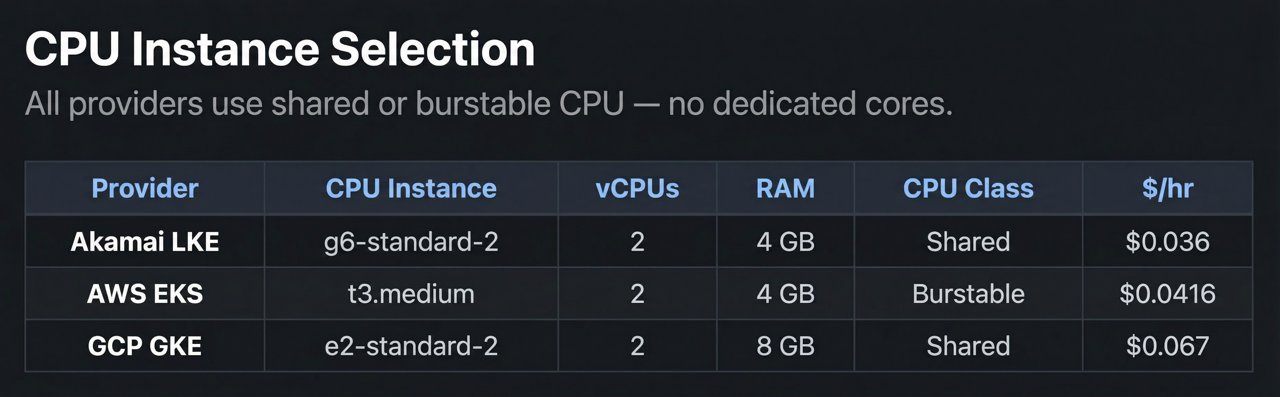
A few things to note:
Akamai's g6-standard-2 is a shared CPU plan at $0.036/hr — the cheapest of the three and nearly half the cost of GCP's equivalent.
AWS's t3.medium is burstable with CPU credits; credit balance was monitored during benchmark windows to ensure it didn't skew results.
GCP's e2-standard-2 provides full vCPU allocation on shared infrastructure with 8 GB RAM (vs 4 GB on LKE and AWS), though the extra memory doesn't materially affect this workload.
The shared-class parity actually strengthens the comparison: no provider gets an unfair advantage from dedicated cores, and CPU utilization is tracked during every run to confirm the bottleneck stays where it should — at the GPU.
Region and Storage Selection
All three clusters are deployed in the Central US corridor to minimize geographic variance in North-South benchmarks. Each cluster is pinned to a single availability zone to eliminate inter-AZ latency noise.
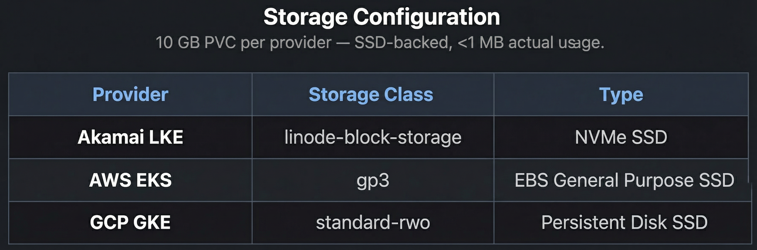
Storage is a 10 GB PVC for Qdrant on each provider, using the default SSD-backed storage class. With only 5 ingested documents (<1 MB), storage I/O is not a factor in these benchmarks — but the classes are documented for reproducibility.
A Measurement Contract for Streaming Inference
How the ruler stays the same across clouds
Infrastructure parity gets you equivalent environments. But that's not enough — you also need to prove you're measuring the same thing, the same way, on each one. In a streaming inference system, "latency" isn't a single number. It's a sequence: how long until the user sees something, how fast tokens flow once they start, and when the response is considered complete.
So the project defines a measurement contract — a fixed SSE (Server-Sent Events) protocol that every provider runs identically:
meta: request context (session/request IDs, model ID, top-k, retrieved documents) and retrieval timing — emitted before generation begins.
ttft: a dedicated signal fired the instant the first token arrives from vLLM, carrying server-side ttft_ms. Most streaming implementations don't emit a separate event for this — having one means both sides of the wire agree on exactly when generation started.
token: each generated token, streamed as produced.
done: server-side timings (ttft_ms, total_ms), final token count, and tokens/sec — the server's complete view.
error: structured failure events. Reliability is part of the scorecard, so errors aren't swallowed.
Client-side timing is the source of truth
The benchmark client starts its clock at request dispatch and measures everything from its own timer — TTFT, TPOT, total latency, and tokens/sec. Server timings ride along in the done event for correlation and debugging, but the scorecard is anchored to what the user actually experiences.
That's deliberate. Provider-specific internals (load balancer buffering, TCP tuning, container networking) can shift where latency hides. Measuring at the client edge captures all of it, keeping the comparison honest regardless of what's happening inside each cloud.
Benchmark Results
7 runs, 3 providers, 3,500 requests each
All benchmark runs were executed from a single client in Dallas, TX against single-zone clusters in Chicago (LKE), Ohio / us-east-2 (EKS), and Iowa / us-central1 (GKE). That geography is part of the signal — TTFT and total latency include the full network round-trip from client to cluster, which is exactly what a real user hitting an API endpoint would experience.
Each provider was tested 7 times under identical conditions: 500 requests per run, 50 concurrent connections, 256 max output tokens. The scorecard reports the median of 7 runs — more resistant to outliers than a mean, and standard practice in benchmark suites like MLPerf and SPEC.
How to read the scorecard
Each metric answers a different question:
TTFT p50 / p95 (Time to First Token): How long until something appears on screen. p50 is the typical experience; p95 captures tail behavior under pressure.
TPOT p50 / p95 (Time per Output Token): Inter-token latency — how smooth the stream feels once it starts flowing.
Latency p50 / p95: Full round-trip from request sent to stream complete.
Duration: Wall-clock time for all 500 requests at 50 concurrency. Shorter means better sustained throughput.
Tokens/sec: Generation throughput across all successful requests. Higher means more efficient GPU utilization.
Success: Completed requests out of 3,500 total. A reliability signal under sustained load.
Monthly cost: Computed from actual deployed instance types and services — not estimated.

🏆 marks the best value in each row.
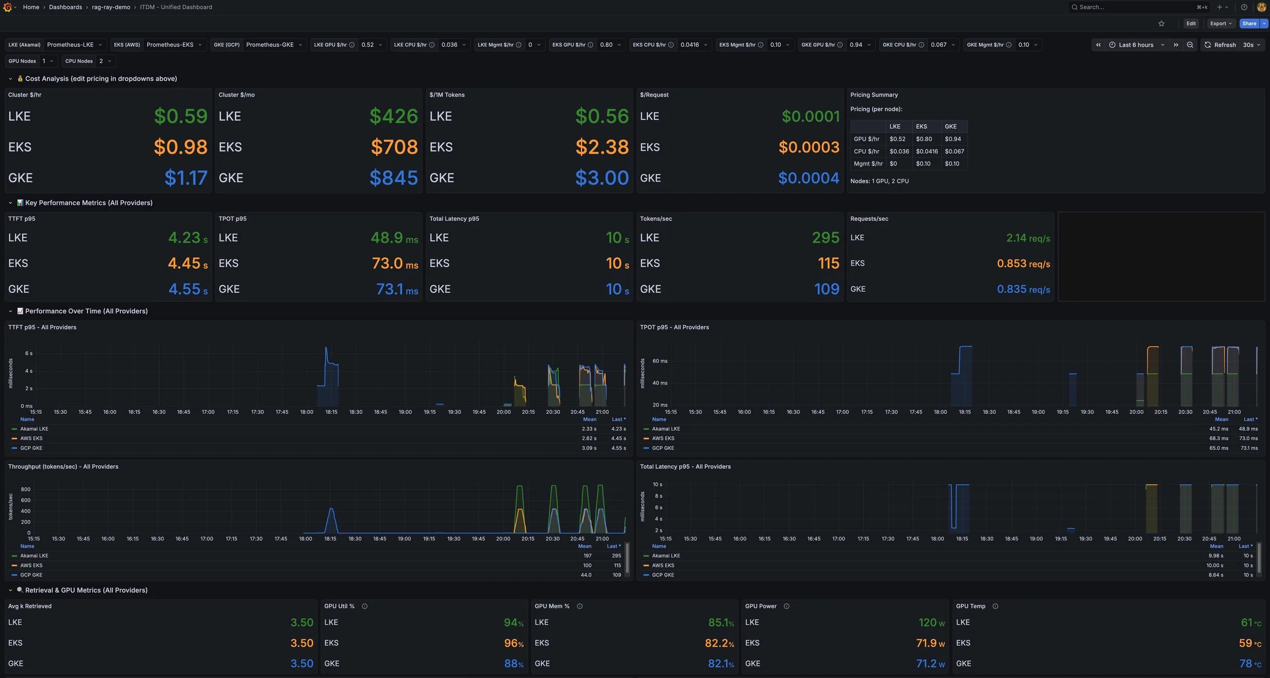
Live Grafana dashboard snapshot during a single benchmark run